Visual Identity of the NDD Brand and its products
Brand presentation
We are extremely proud of our company; hence, we share some guidelines so you can understand how to effectively use our brands and sub-brands.
Here you will find guidelines regarding the correct application of logos, visual elements, colors, typography, among other items. It is essential that you fully consider this content when applying any element that involves one of NDD’s brands, whether in the context of internal or external communication, digital or offline.
Development of the logo
The combination of basic shapes and primary colors represented by the square and the circle generate new creative possibilities and inspire transformation. This mutation movement represents the essence of NDD and our willingness to create new solutions and reinvent ourselves.
In a complex world, we propose simplicity, creativity, intelligence, and world-class technology to transform and reimagine processes, as well as make the daily routine of our customers, and their customers, simpler, more resolute, and valuable.
Logo + Icon

Ícone
The brand icon should be applied alone only in more limited spaces, indicative of action such as applications, thumbnails, or bookmarks.
Variations
The NDD logo presents a range of variations that fit different situations, as a brand of simple shapes and easy to read in several sizes and assorted media.

Colored logo with white primary background

Colored logo with black secondary background

Positive monochrome logo

Negative monochrome logo

Logo with tagline

Logo with NDD name
Grid - development and reduction
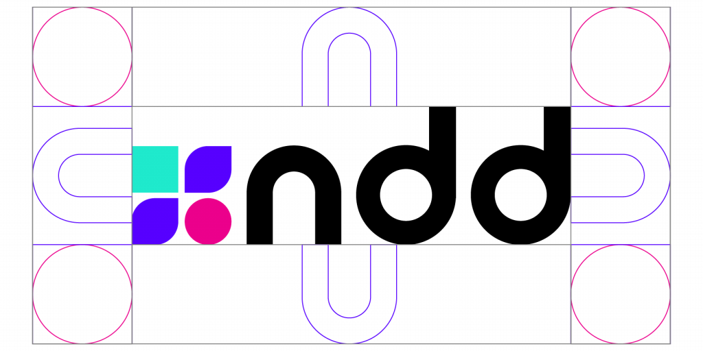
As a safety margin, the graphic reference for distance is always the letter N of the logo proportional to the application size.

Digital - 70 - 22px

Print- 2,5x0,8px

Grade Segurança – Imagem
Brand architecture
Brand architecture is an important concept for structuring the relationship between the main brand, called the parent brand (NDD), and its sub-brands that name products and services.
These definitions are fully connected to the company’s expansion strategies in the medium and long term and are essential for branding management. The brand architecture strategy is a hybrid model, divided in monolithic and endorsement.
Monolithic
The monolithic architecture model is used for products that are essentially technology and that are part of NDD’s core business.
The products included in this model must receive the NDD name before their conceptual name (e.g., NDD SPACE).

Endorsement
The endorsement architecture model provides greater autonomy to the brand regarding its positioning and visual identity, enabling horizontal expansion in specific markets and with products that are not necessarily of the company’s core business or based on technology. Secondary signature with the expression “BY NDD”.


Colors
Within the developmental thinking, our colors emerge from the idea of composition among elementary colors in the formation of secondary and advanced compositions based on the sum of their elements.
Primary colors
Green
C:58 M:0 Y:33 K:0
R:31 G:235 B:234
#1FEBCC
3265C
Pantone®
Pink
C:0 M:99 Y:0 K:0
R:237 G:0 B:140
#ED008C
RED C
Pantone®
Purple
C:78 M:78 Y:0 K:0
R:87 G:0 B:255
#5700FF
2736 C
Pantone®
White
C:0 M:0 Y:0 K:0
R:255 G:255 B:255
#FFFFFF
000 C
Pantone®
Black
C:20 M:0 Y:0 K:100
R:0 G:0 B:0
#000000
BLACK6 C
Pantone®
Secondary colors - complementary
Red
C:12 M:100 Y:100 K:4
R:240 G:0 B:0
#CC0000
2665C
Pantone®
Orange
C:4 M:800 Y:100 K:1
R:226 G:75 B:140
#e24b00
166C
Pantone®
Green
C:70 M:0 Y:46 K:0
R:30 G:193 B:166
#1ec1a6
2240C
Pantone®
Blue
C:20 M:0 Y:0 K:100
R:0 G:98 B:204
#0062cc
2387C
Pantone®
Purple
C:76 M:76 Y:0 K:0
R:121 G:76 B:224
#7944e0
2665C
Pantone®
Best practices and applications
It is extremely important to pay attention to the strengths of the brand’s contrast in relation to the background colors where the logo is applied. White always on stronger and heavier tones, black preferably on a white background, or in other cases soft and pastel tones.
The brand should preferably be applied on backgrounds that are related to its color palette.


Questions?
Send your question or request regarding the NDD brand and its products to our team at brand@ndd.tech.


